Project Goal
At Kartenliebe.de, customers can create personalised photo calendars by choosing their preferred format, material, and design.
The aim of this project was to redesign the calendar pre-configuration flow and transform it from a task-heavy, technical process into an engaging and inspiring experience.
Design Process

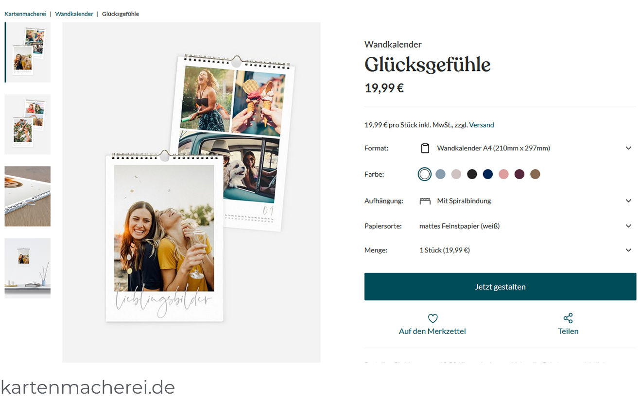
Market & Competitor Scan
To understand common patterns and expectations, I reviewed a small selection of competitor websites.
The layout across photo calendar configurators appeared to be highly standardised:
- Large preview images on the left
- Multiple configuration options (mostly dropdowns) on the right
- Primary call-to-action placed below
While this familiar pattern supports ease of use and strong external consistency, it also results in very similar experiences across providers, offering little differentiation or emotional engagement.
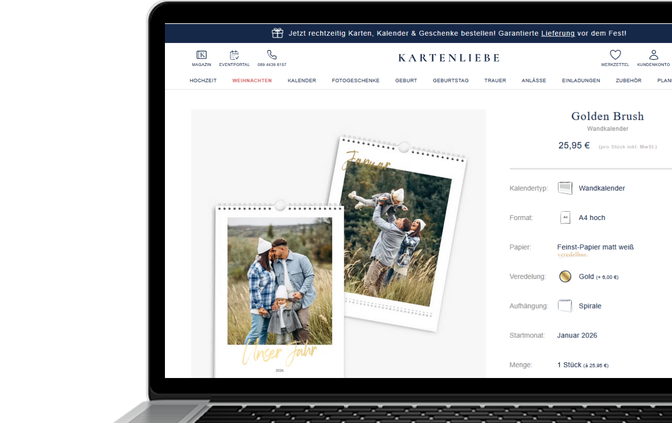
UX Audit
I analysed the existing calendar pre-configuration flow to identify friction points and areas of cognitive overload. The annotated screenshot below highlights the key issues and opportunities for improvement.

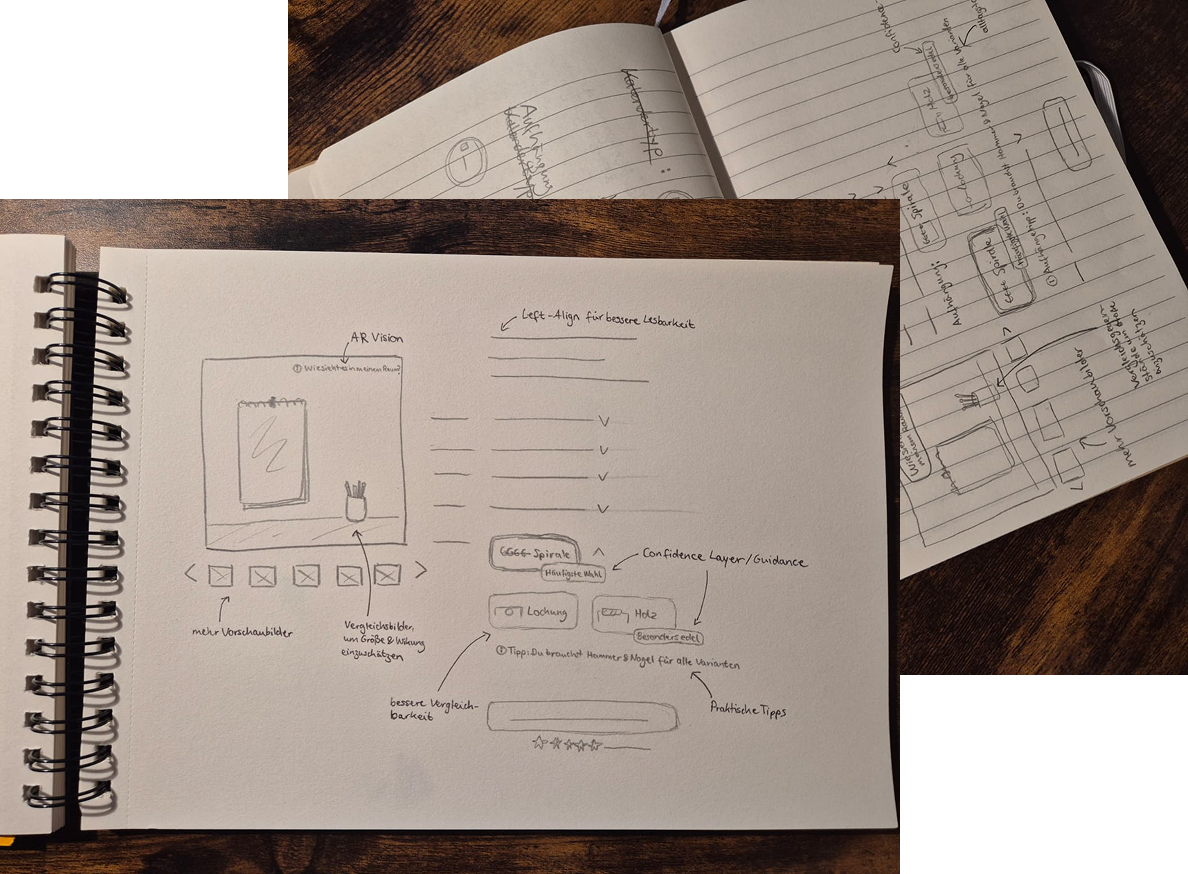
Concept Exploration & Sketches
I explored multiple approaches for the calendar pre-configuration through quick paper sketches, visualising layouts and interactions before moving to digital wireframes.
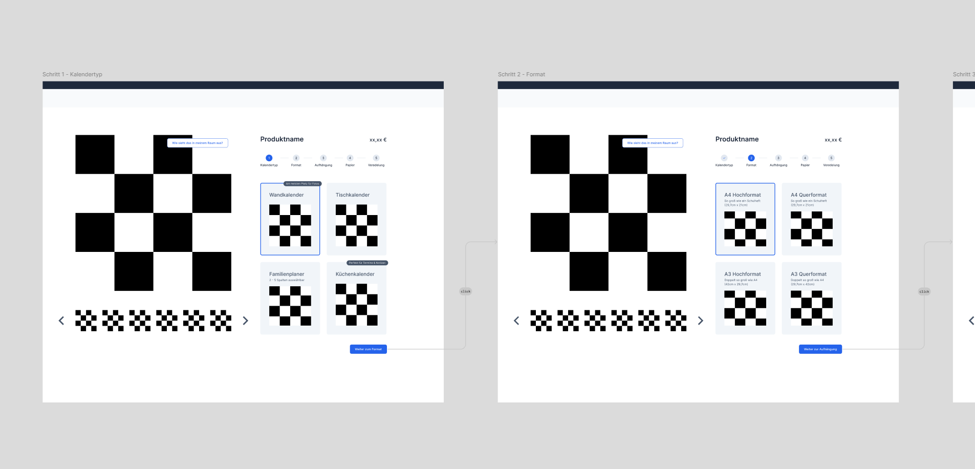
Wireframes & User Flow
Next, I created mid-fidelity wireframes to define the layout, content, and simple user flow of the calendar pre-configuration. These helped ensure clarity and consistency before moving to visual design.
Visual Design & Final Concept
The redesign focuses on guiding users step by step and transforming a potentially overwhelming selection process into an enjoyable experience. Key improvements include:
- Step-by-step configuration:
Users are guided through the calendar creation process rather than being presented with all options at once. - Clear visual hierarchy:
Large tiles and preview images make it immediately clear what each option represents. - Helpful guidance & recommendations:
Labels like “Frequently purchased” give context and support decision-making. - Confidence & reassurance:
Visual cues and progress indicators help users feel confident at each step. - Transparency:
Users see live price changes and relevant information in one place.


Next Steps
While this case study focuses on the design process, user testing and analytics were not part of the scope. In a next phase, it would be valuable to validate the new configuration flow with real users including testing the emotional impact and overall user experience. Metrics such as completion rates, conversion, and time-on-task should be tracked as well. These insights would help quantify the impact of the redesign and identify further opportunities for improvement.
* Some of the images are owned by Kartenliebe GmbH